UX Audit
Usability analysis, visual overload, navigation flows and experience issues in current dashboards.
A technically correct report can fail if the user does not understand it. We apply UI/UX principles, color theory and storytelling to transform complex dashboards into clear, adopted experiences.
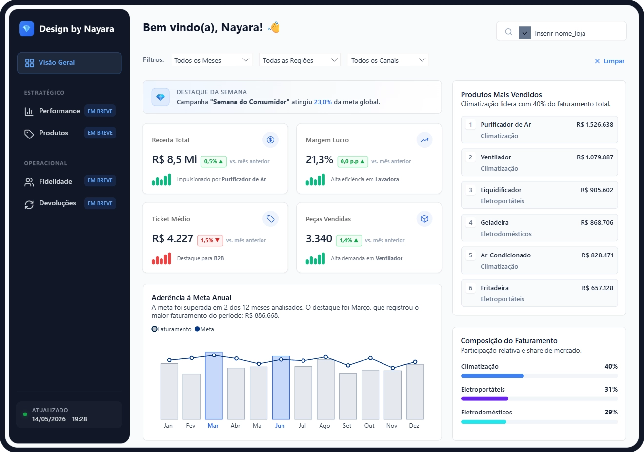
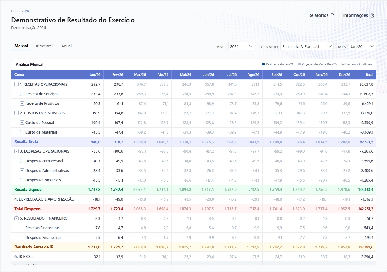
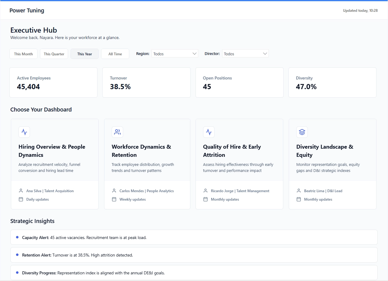
Real examples of dashboards developed by our team. Click to view the live report.
Usability analysis, visual overload, navigation flows and experience issues in current dashboards.
Complete visual remodeling: information hierarchy, colors, typography, grid and corporate visual identity.
Creation of .json themes, reusable components, corporate templates and style guide for the entire team.
WCAG contrast, screen readers, tooltips, dark mode and inclusive navigation on all reports.
Many Power BI reports are technically correct but fail to adopt: users simply cannot extract value from them. The problem isn't the data: it's the presentation.
Well-designed dashboards increase usage rate, reduce time to insights, and decrease the volume of requests to the data team. A good Design System Power BI ensures consistency across the organization and speeds up the creation of new reports.
We apply principles of Information Design, Gestalt and Dataviz to Power BI. We work with the Double Diamond methodology: discovery, definition, ideation and delivery: adapted to the context of corporate reports.
We start with a UX audit of existing reports, identify key issues, and deliver a prioritized redesign plan. For companies that want standardization, we created a complete Design System with Power BI themes, templates and style guide.
Whether you're evaluating report creation, Figma layouts, visual improvement, or Power BI evolution, these pages help break down each front.
Dashboard and report projects focusing on usability, narrative and decision support.
Definition of wireframes, components and visual patterns before implementation in Power BI.
Modeling, publishing, governance, UX and evolution of the end-to-end analytical environment.
Improvements in layout, visual clarity, information organization and dashboard usage experience.
More efficient analytical base to support fast, consistent and scalable reports.
Operational reliability so that well-designed dashboards also deliver flawlessly updated data.
Choose the best time for a no-obligation meeting. In 30 minutes, we understand your scenario and present the best path.
Are you ready to get the most out of your data environment? Our experts evaluate your scenario without obligation.
Fill out the form below and our team will get in touch to better understand your needs and start a successful partnership.
We transform your reports into more intuitive experiences, with UX, storytelling and a visual identity that facilitates decision making.